Death In The Himalayas
Previously I made an graphic visualizing the elevation profile of over two thousand Everest expeditions. Today, I’m sharing a visualization of the number of deaths during expeditions in 5 mountains: Ama Dablam, Cho Oyu, Everest, Lhotse, and Manaslu. why these mountains? Because they have the largest number of expeditions overall (since 1921), at least according to the Himalayan Database (which is where the data for these visualizations is from).
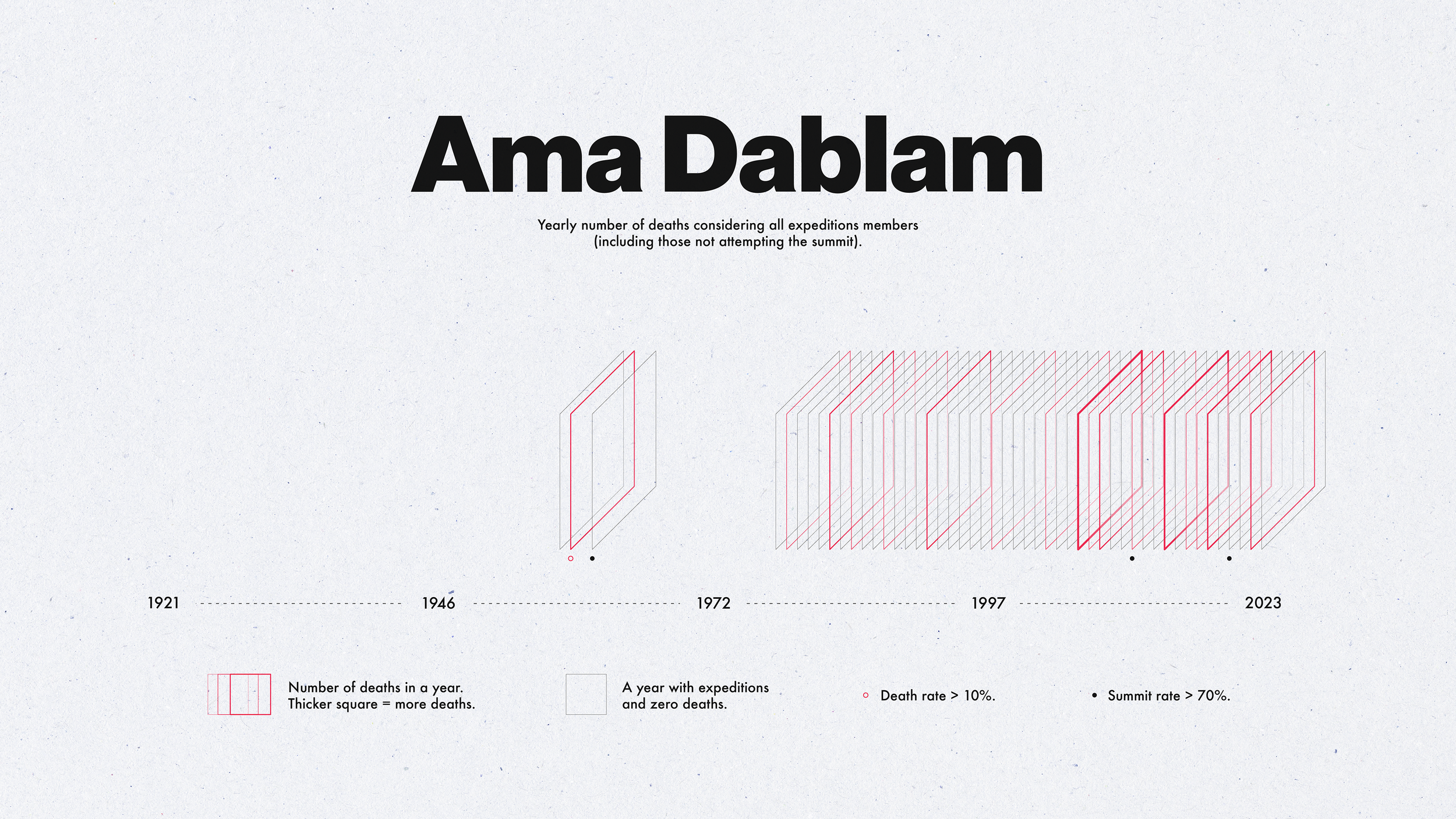
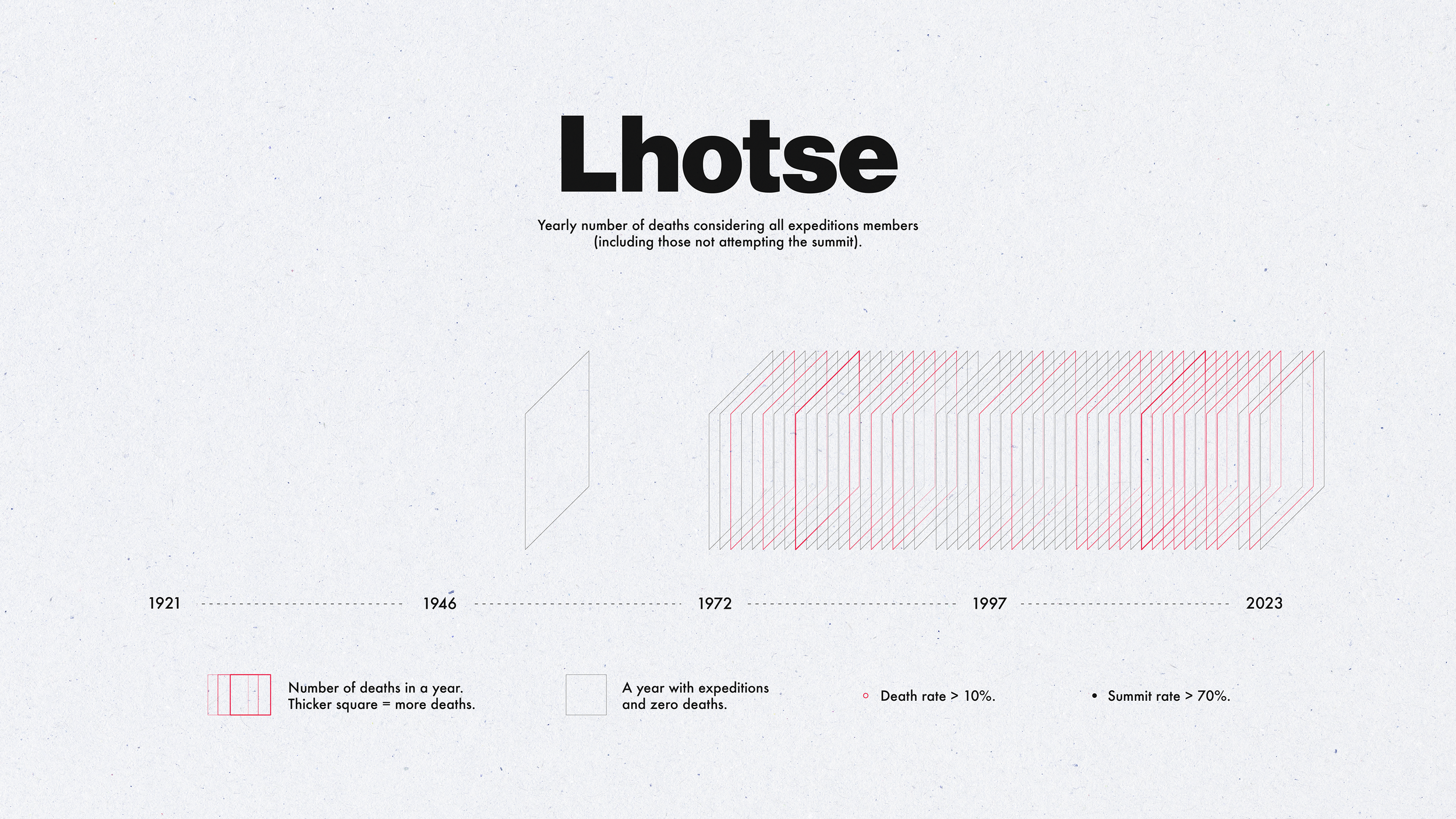
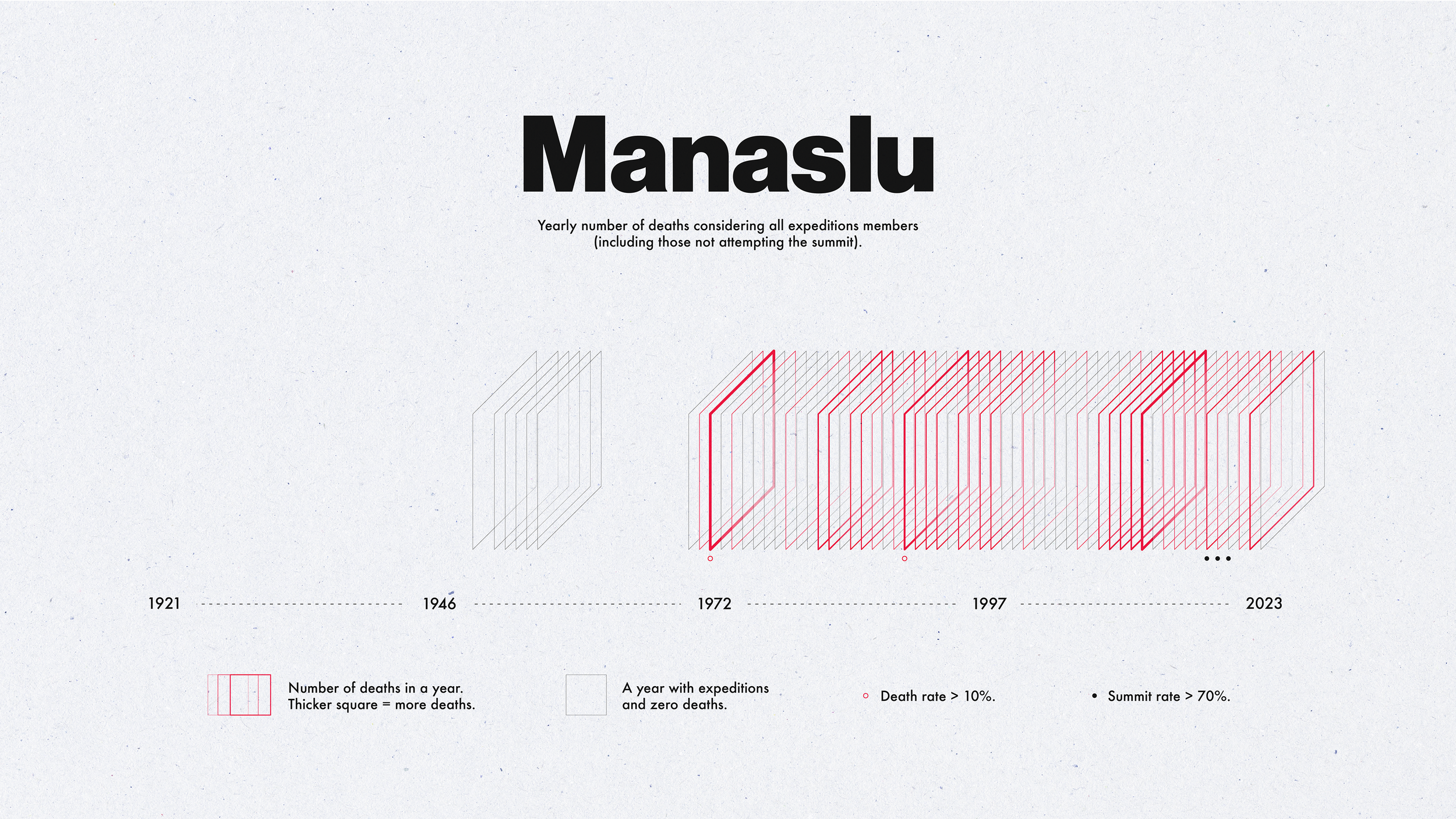
In each visualization black squares represent years during which there were expeditions but no deaths, and red squares represent years where there were deaths (the thicker the square, the more deaths occurred during that year). There are also some small dots below some of the squares: a red dot indicates a year where the death rate was above 10% (meaning 10% of all expedition members, and a black dot represents a year where the summit success rate was higher than 70% (meaning at least 70% of all expedition members summited the peak).
The number of expedition members for each (peak, year) combination is the sum of hired and non-hired members, regardless of whether the member was attempting to summit or not. The number of deaths similarly does not distinguish between deaths of members that were attempting a summit and deaths of members occurring despite not attempting the summit (for example, a camp doctor might have passed away due to altitude sickness and is still counted in the total n umber of expedition deaths).
Because the raw number of deaths is heavily skewed towards Everest, I log-transformed the death count before plotting (this transformation is applied only to the red squares).
How was this made?
I used Python to clean the data and format it for plotting and then used, D3.js to create the main part of the plot (the squares ordered along a the timeline). The code can be found on GitHub. Because this is a static visualization I decided to adjust the layout design in Illustrator (rather than doing everything in D3). To this end, I exported the D3 plot as an SVG and imported into Illustrator. I added some final touches (e.g., paper texture) in Photoshop.
If you’re interested in details, I wrote an article on Medium where I go through the entire process for generating this visualization.